The Beauty of the overlooked
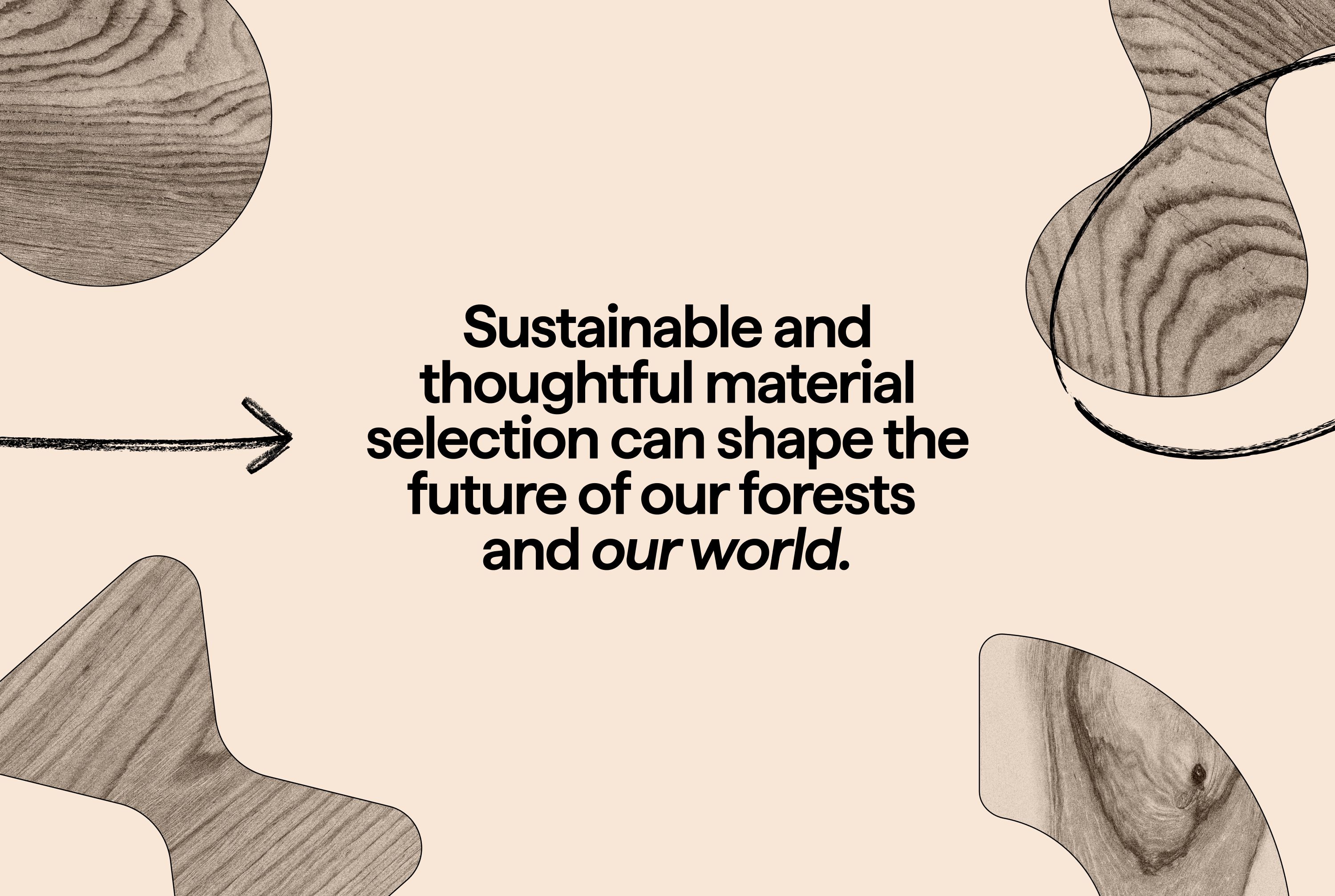
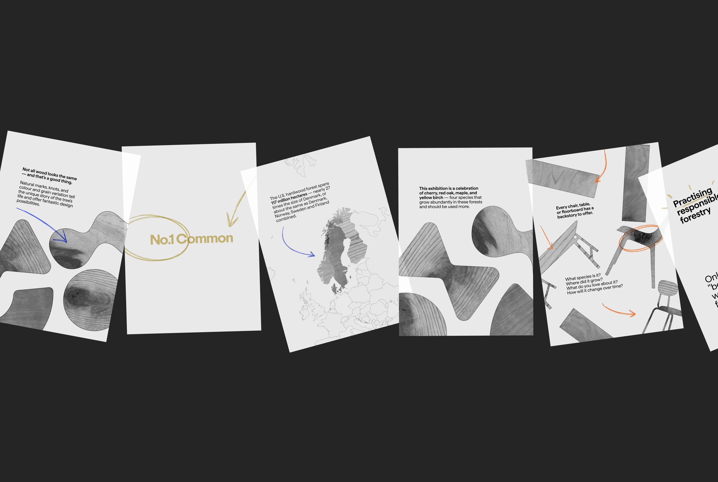
Each year more American hardwood is lost to natural tree mortality and left to rot or burn than is used. Not because of quality but perception. Veins, knots and natural irregularities are too often dismissed as flaws and as a result so much viable wood is left untapped. The American Hardwood Export Council (AHEC) exists to challenge this mindset. As the global voice of the US hardwood industry, AHEC advocates for thoughtful material use, championing the performance, character and environmental benefit of lower grade timber.
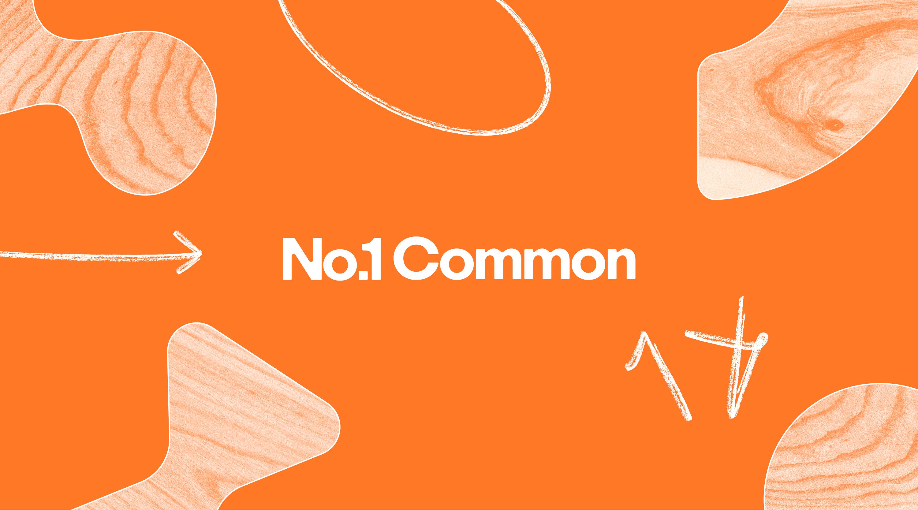
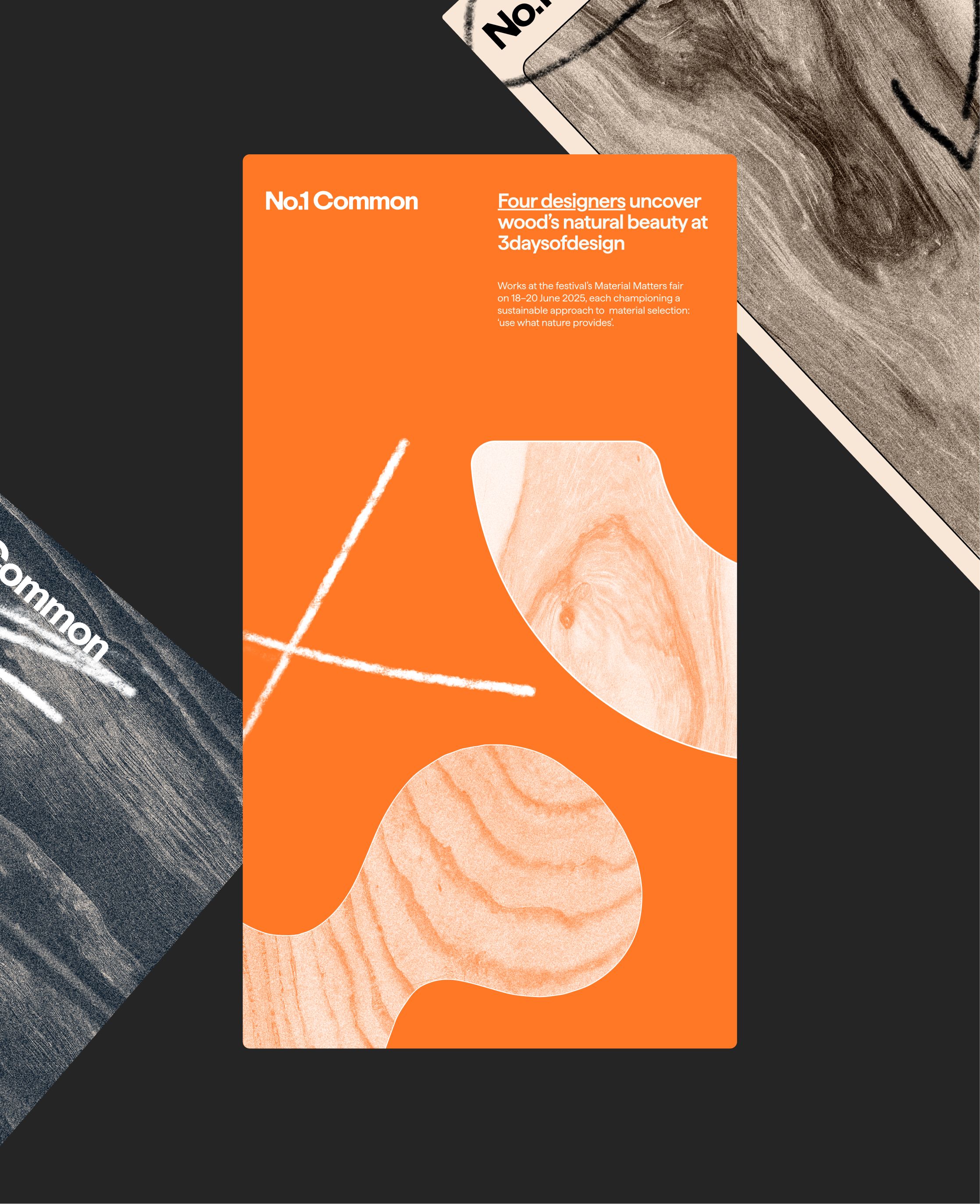
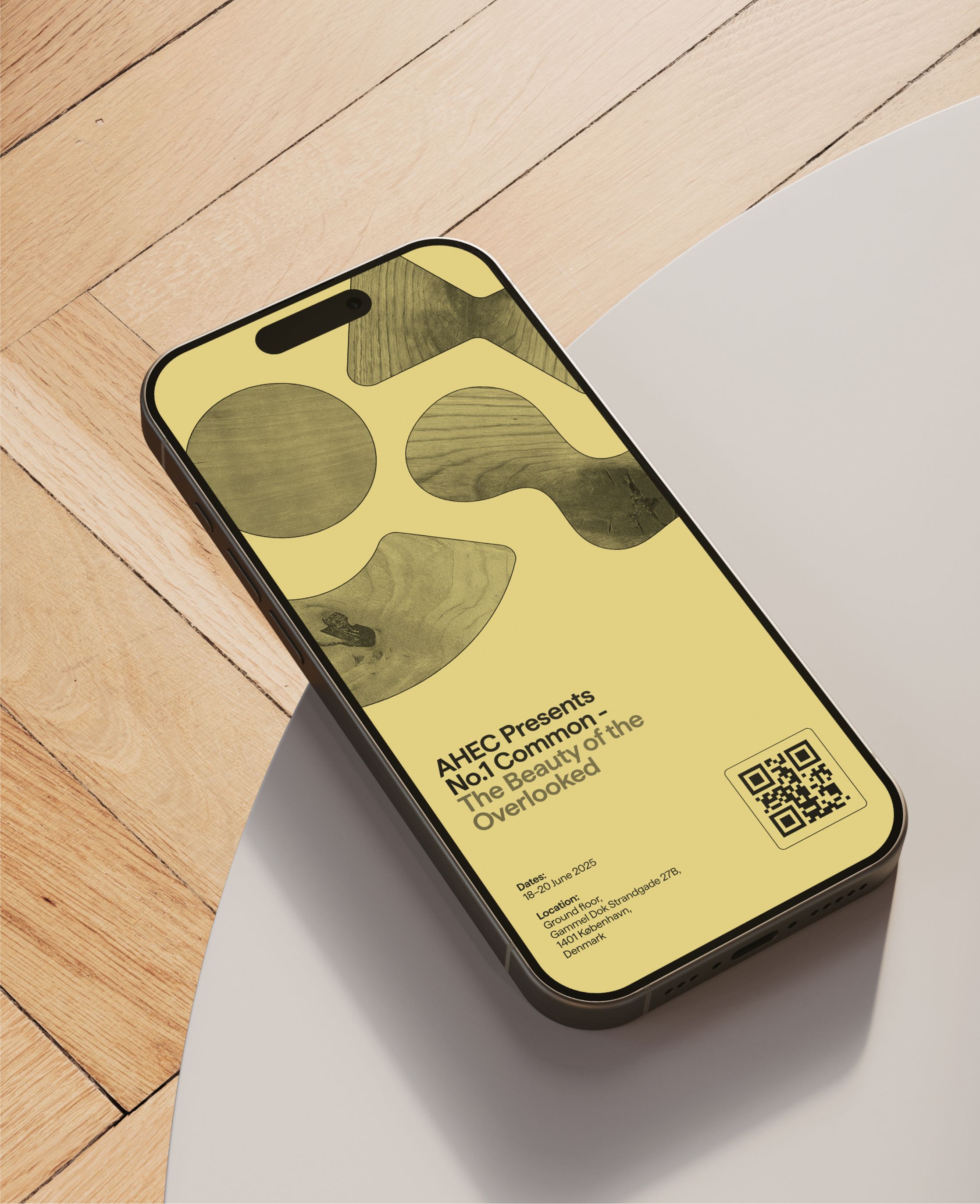
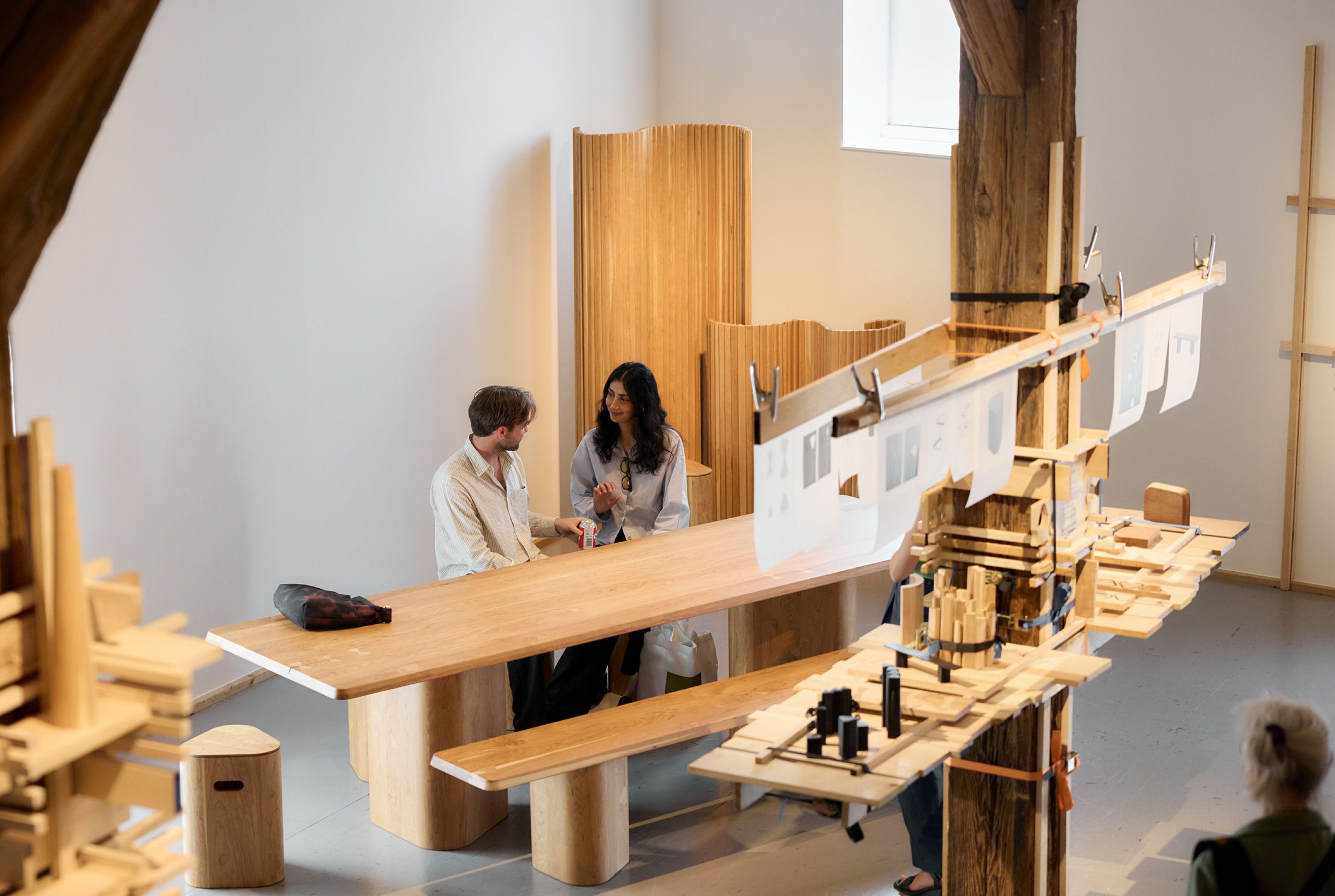
At 3daysofdesign, Copenhagen, AHEC launched No.1 Common: a project built to shift perspectives on the beauty and potential of underused American hardwoods. Artists Andu Masebo, Daniel Schofield and Anna Maria Øfstedal Eng were commissioned to explore the material through process led installations, revealing the possibility within the grade. Our task was to build a bold brand identity and design that supports this story across every detail, from type and colour to signage and interactive touchpoints, making No.1C feel not only seen but understood.


A Material first brand
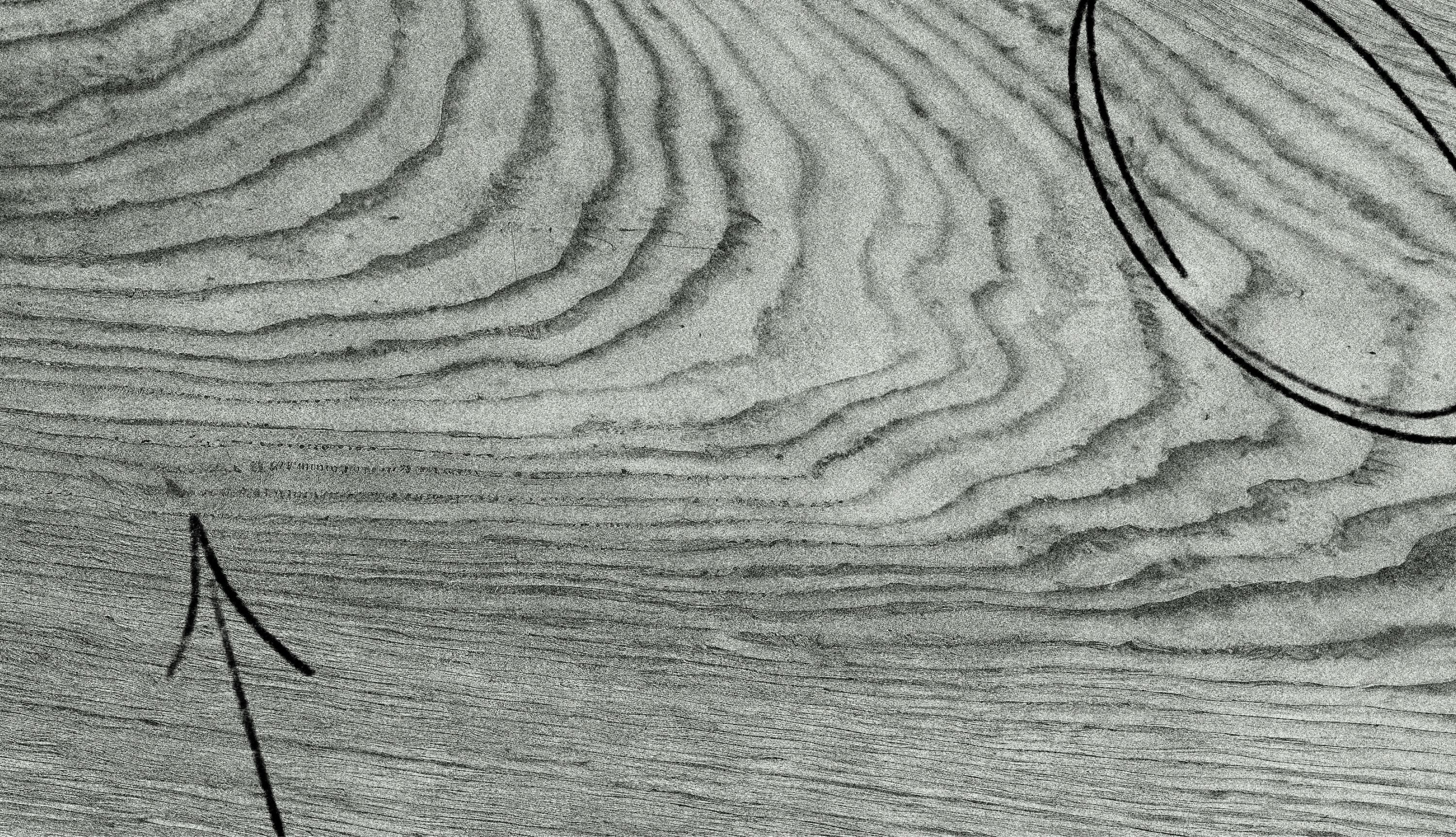
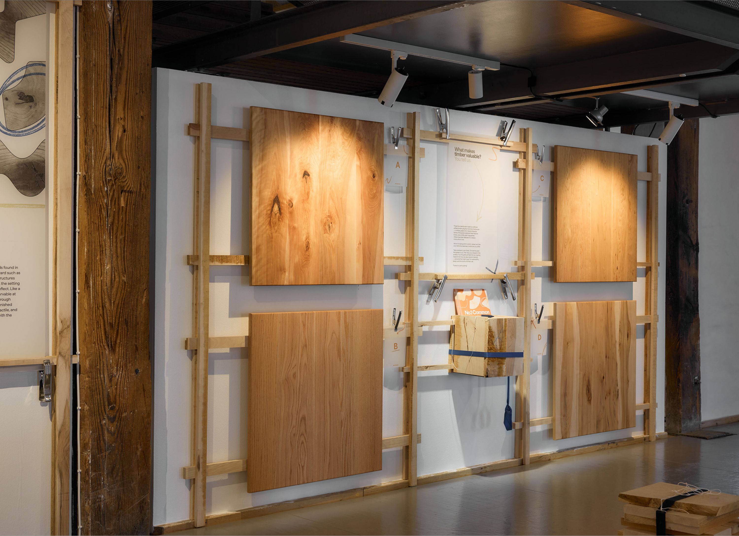
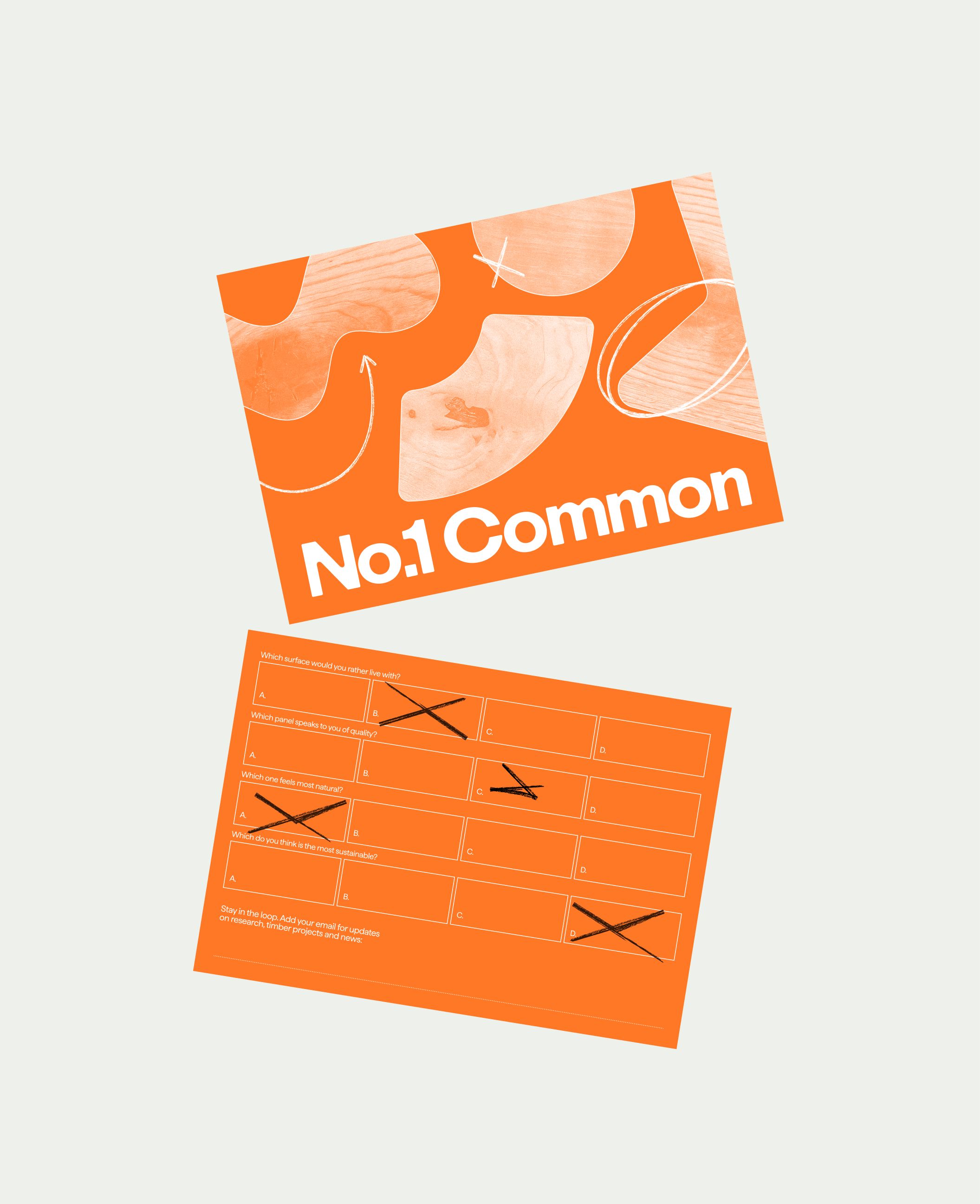
Centred around the visual richness and qualities of the ‘flawed’ timbers, the brand identity captures the textures and imperfections to create a confident, expressive design system. High res scans of each featured timber are incorporated throughout the brand identity and exhibition design, their textures upscaled to create a tactile and compelling foundation across all applications.
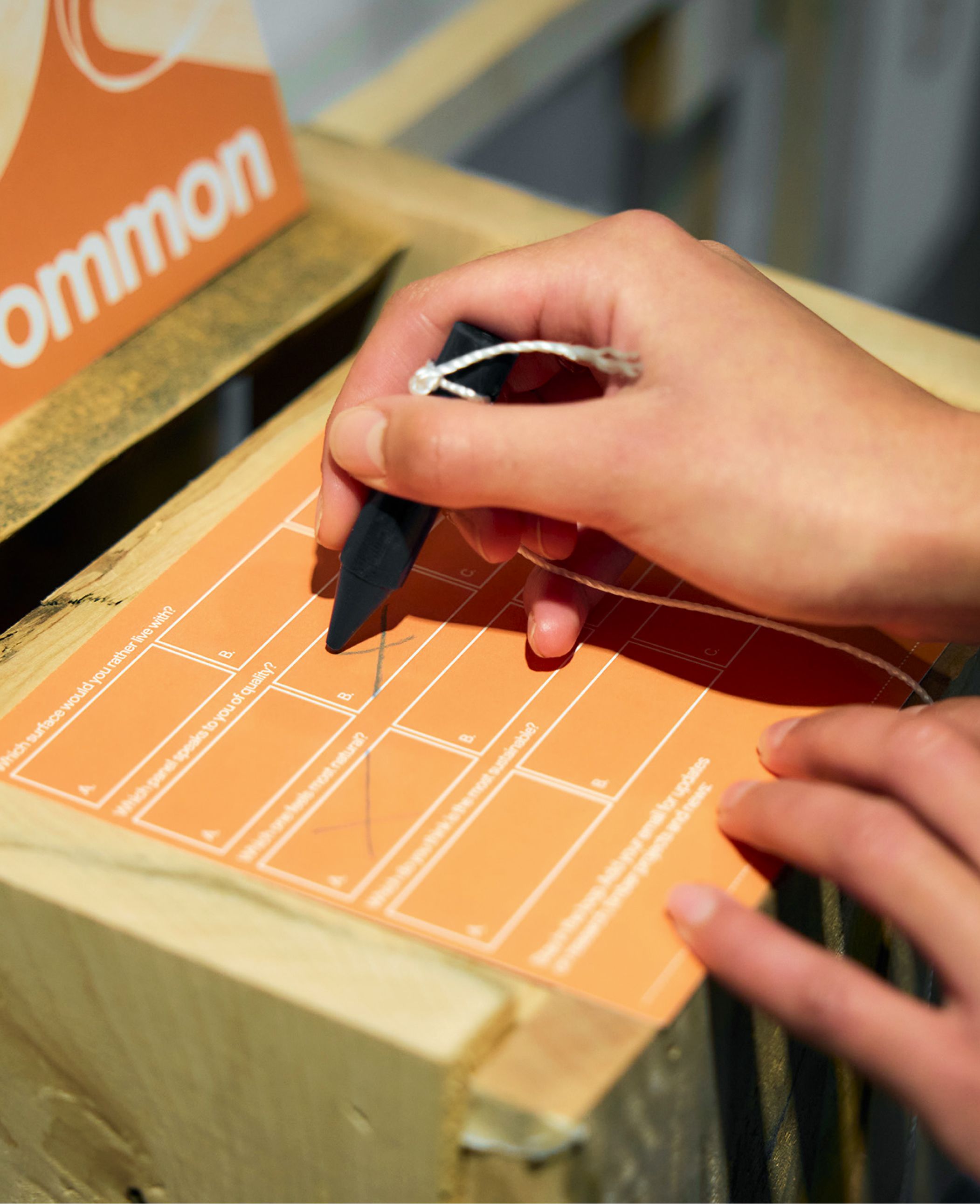
Every visual detail was crafted to immerse and reframe how No.1 Common is seen and valued. A stripped back colour palette allowed the exhibition’s information and intent to take the lead. Considered moments of orange and blue, drawn from industry ratchet straps, were introduced to balance the tone and reinforce the connection to the raw material journey. Crayon markings, subtly reference those made when grading timber, were layered into the system to add an authentic, process led feel.

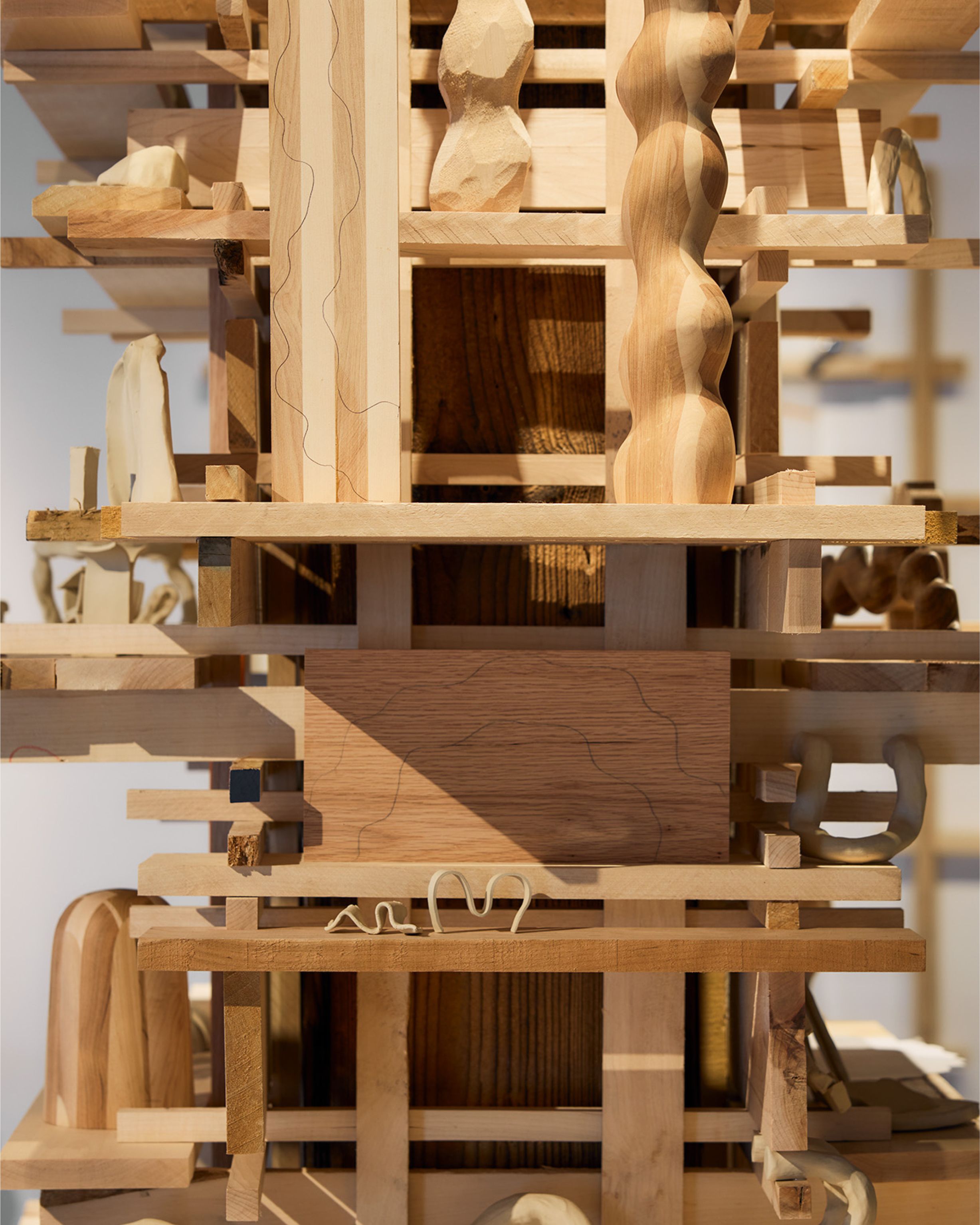
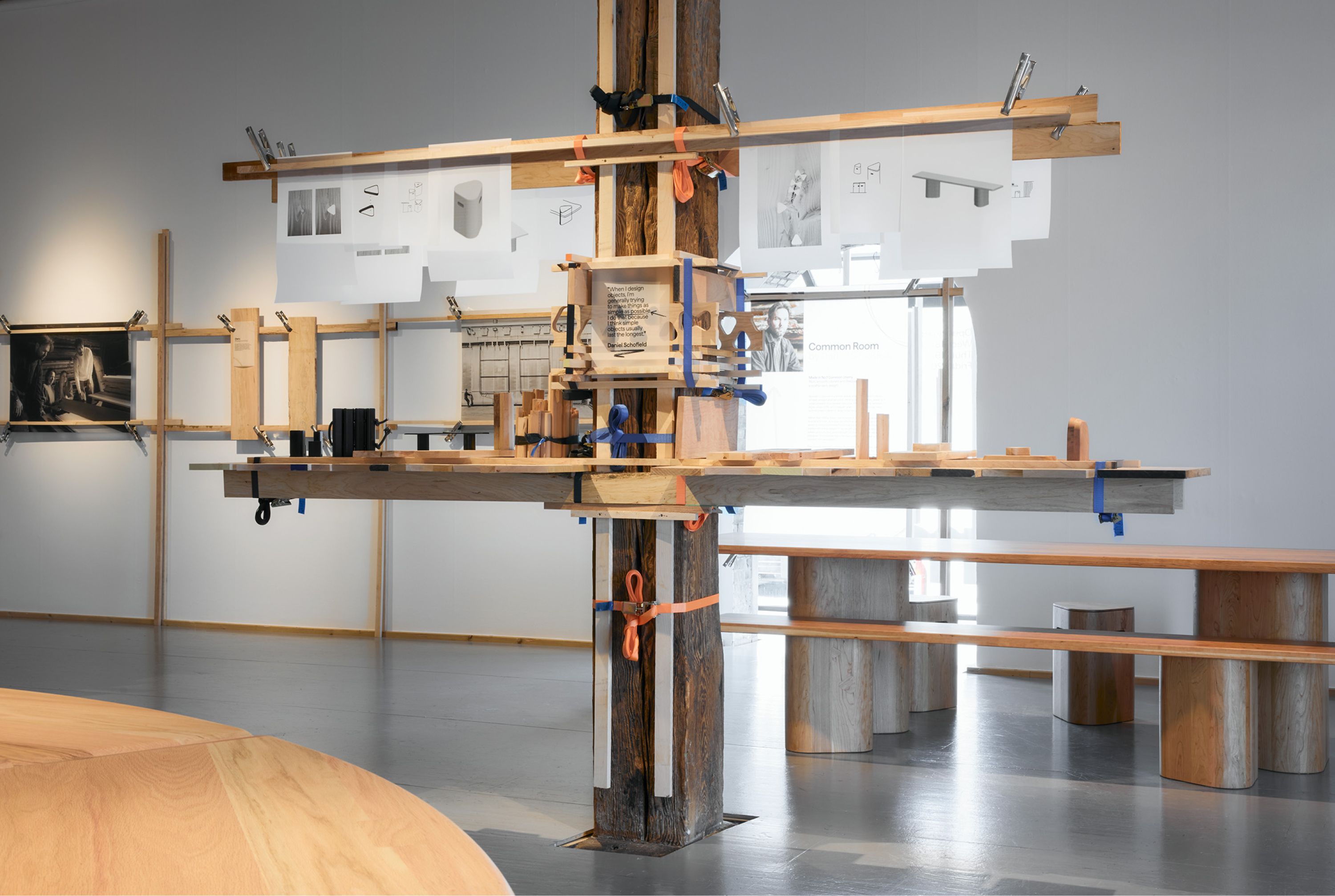
The identity strikes a balance between playful and editorial, flexible enough to house dense information but still remain expressive. The typographic hierarchy adds clarity and maintains visual balance across all brand applications. A logotype leads the identity, ensuring the brand’s tone of voice remains direct and clear whilst rounded corners on the logotype connects it visually to the brand shapes and creates a subtle tangible feel. Bespoke shapes and graphic motifs draw on the visual language of each artist, ensuring the brand identity and design remains cohesive throughout.


Translating purpose into presence
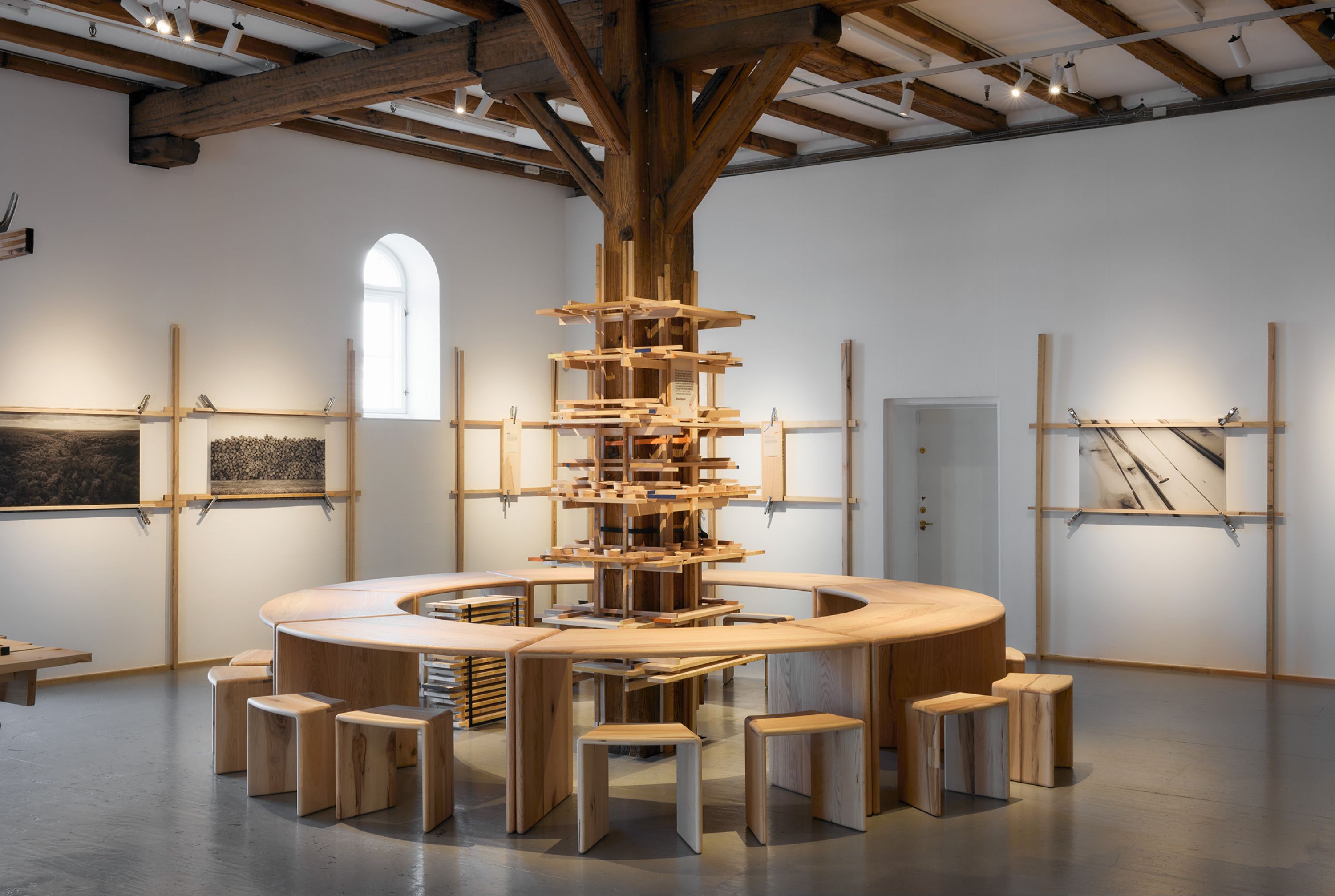
The No.1 Common exhibition unfolds slowly as an immersive space that invites curiosity and reflection, encouraging visitors to move freely and uncover detail through exploration. Drawing from the rawness of the material itself, the art direction is led by texture and contrast.
Together, the space and design system create an experience that feels both precise and instinctive, reframing lower grade timber as a material with value.
Special thanks to Ellen and the AHEC team for collaborating with us on such an incredible project! And to the four commissioned artists, Andu Masebo, Daniel Schofield, Anna Maria Øfstedal Engand Kia Utzon-Frank whose designs helped bring the ‘No.1Common’ project to life.