Tom Massey Studio
A leading voice in regenerative landscape design. We evolved Tom Massey Studio’s identity to balance ecological intelligence with emotional storytelling.
Challenge
Framing ecological complexity with clarity.
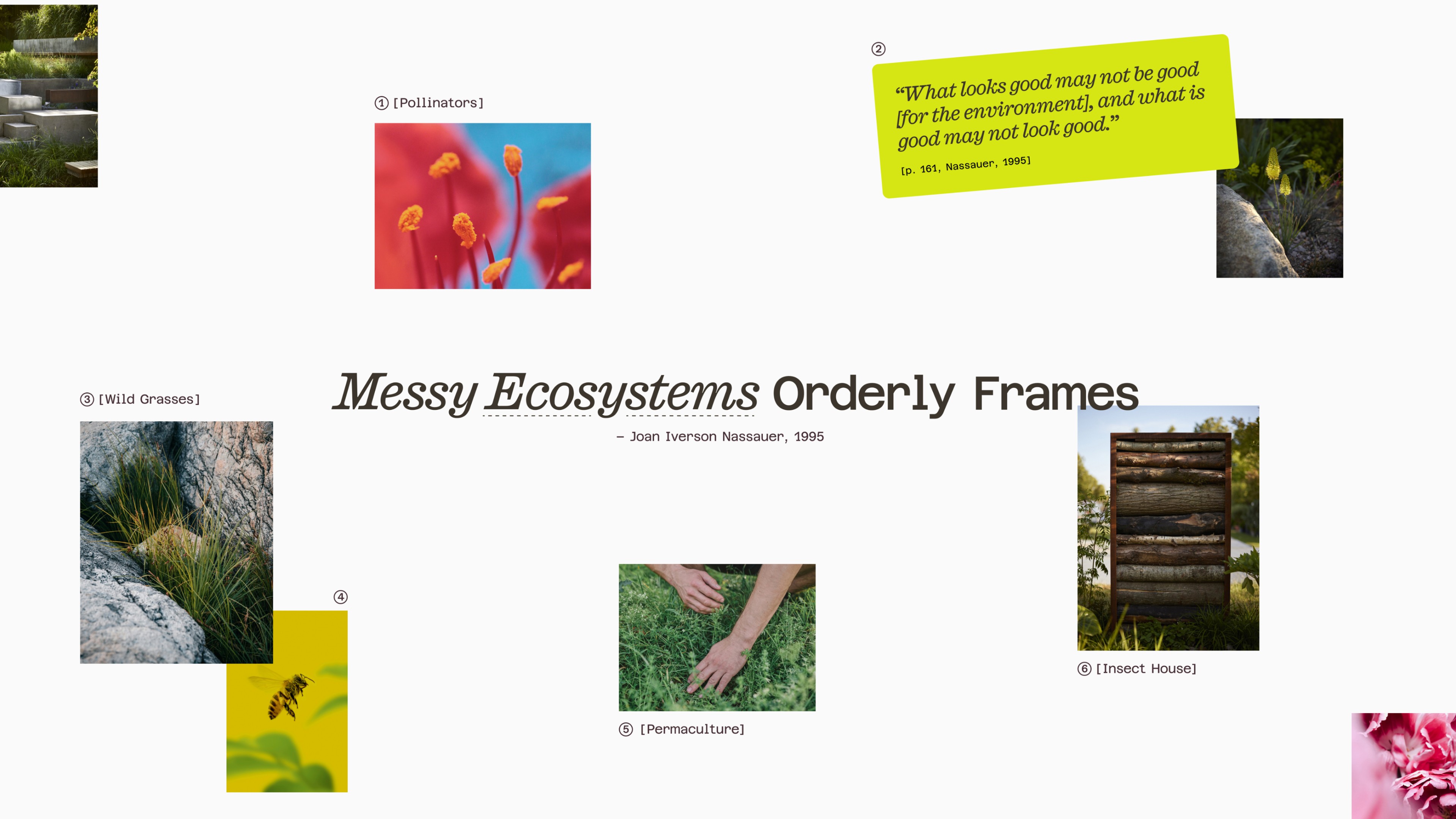
Tom Massey Studio had earned recognition for its innovative projects and regenerative ethos, but its brand identity had not evolved alongside its rising reputation. The studio needed a system that expressed both the scale and intimacy of its work, ecological richness balanced by human intention. Inspired by Joan Iverson Nassauer’s idea of messy ecosystems, orderly frames, the challenge was to translate this principle into a visual identity: one that captured the layered complexity of landscapes within a refined, contemporary framework.

Solution
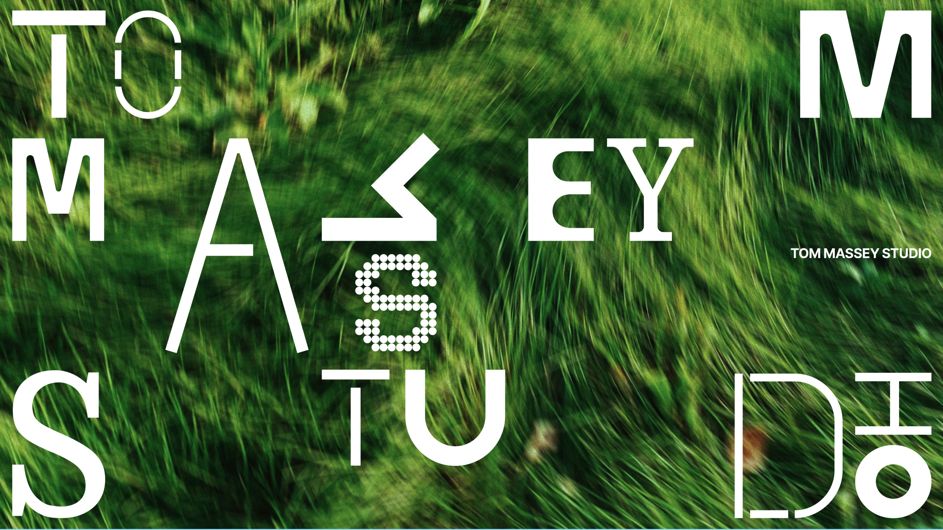
A visual system balancing wildness and order.
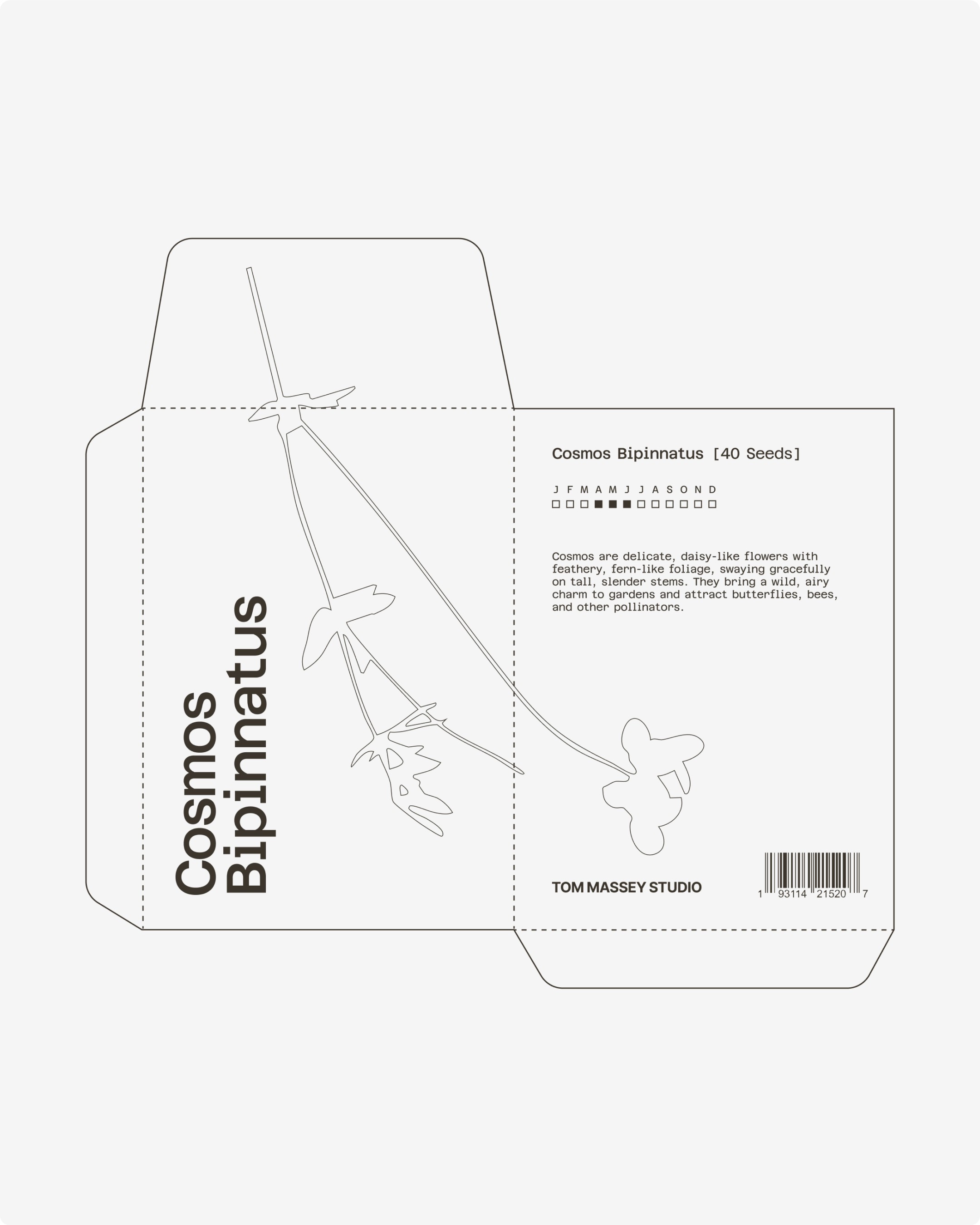
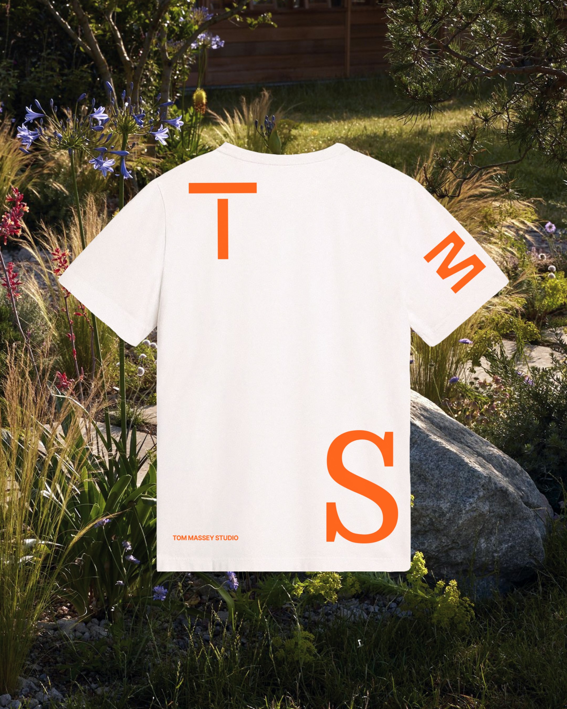
We built a brand identity that mirrors the studio’s regenerative ethos. The logotype feels organic yet precise, while editorial typography and structured layouts provide order and legibility. A natural palette of soil, stone, foliage and water grounds the brand in place and ecology. Imagery treatment emphasises rhythm, layers and texture, evoking the richness of living systems. The result is an identity that creates structured frames through which the studio’s diverse and dynamic projects can be seen, understood and celebrated.

Results
Wild landscape designs shaped with care, framed for the future.
The new identity has repositioned Tom Massey Studio as a leading voice in landscape design. By framing ecological richness within refined clarity, the brand now communicates with strength across proposals, media and public platforms.