Duel
Helping brands build real relationships through advocacy. We refreshed Duel’s identity and digital presence to clearly express their vision and value.
Challenge
Advocacy that’s focused, without losing feeling.
As it's become harder for brands to reach people, and even harder to earn their trust, advocacy has never mattered more. Duel helps brands tap into that power by turning loyalty into meaningful action.
But as the platform grew, its identity no longer reflected everything it had to offer. The challenge was to show that Duel is strategic and credible, without losing the human connection that makes it different. It needed a brand that could speak to both marketers and founders, standing out in a space where real connection is often missing.
Solution
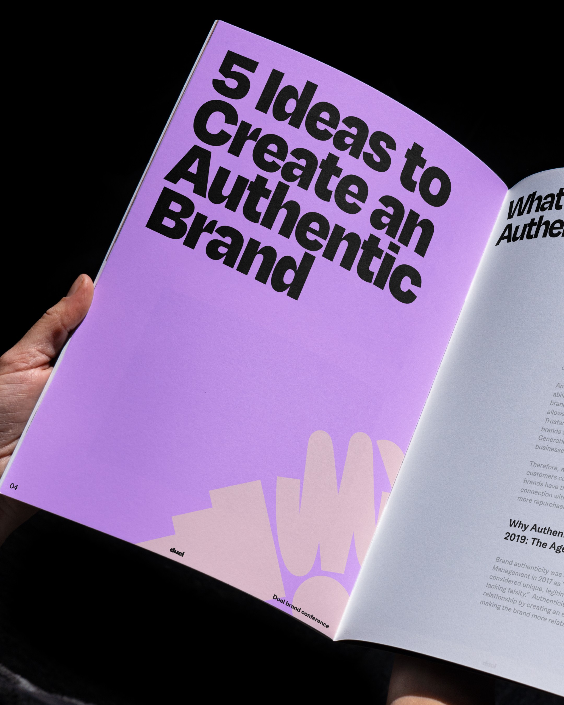
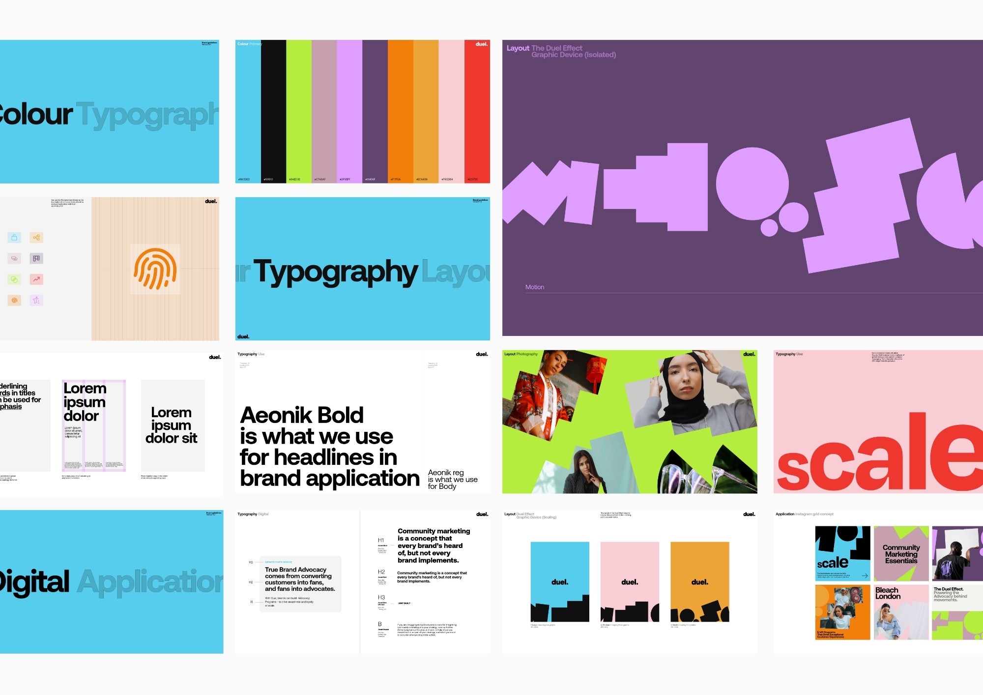
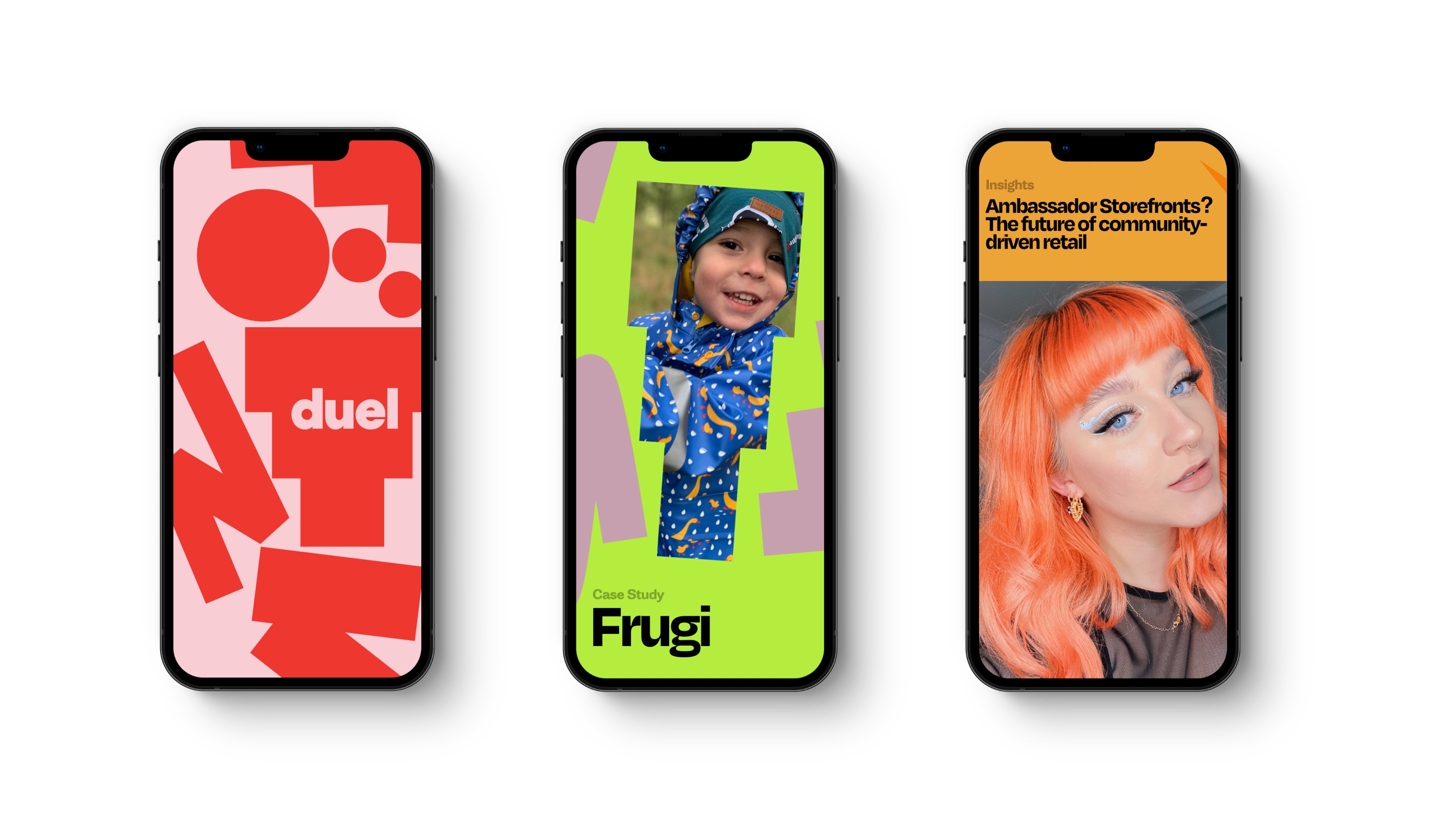
A brand system that feels smart, clear and human.
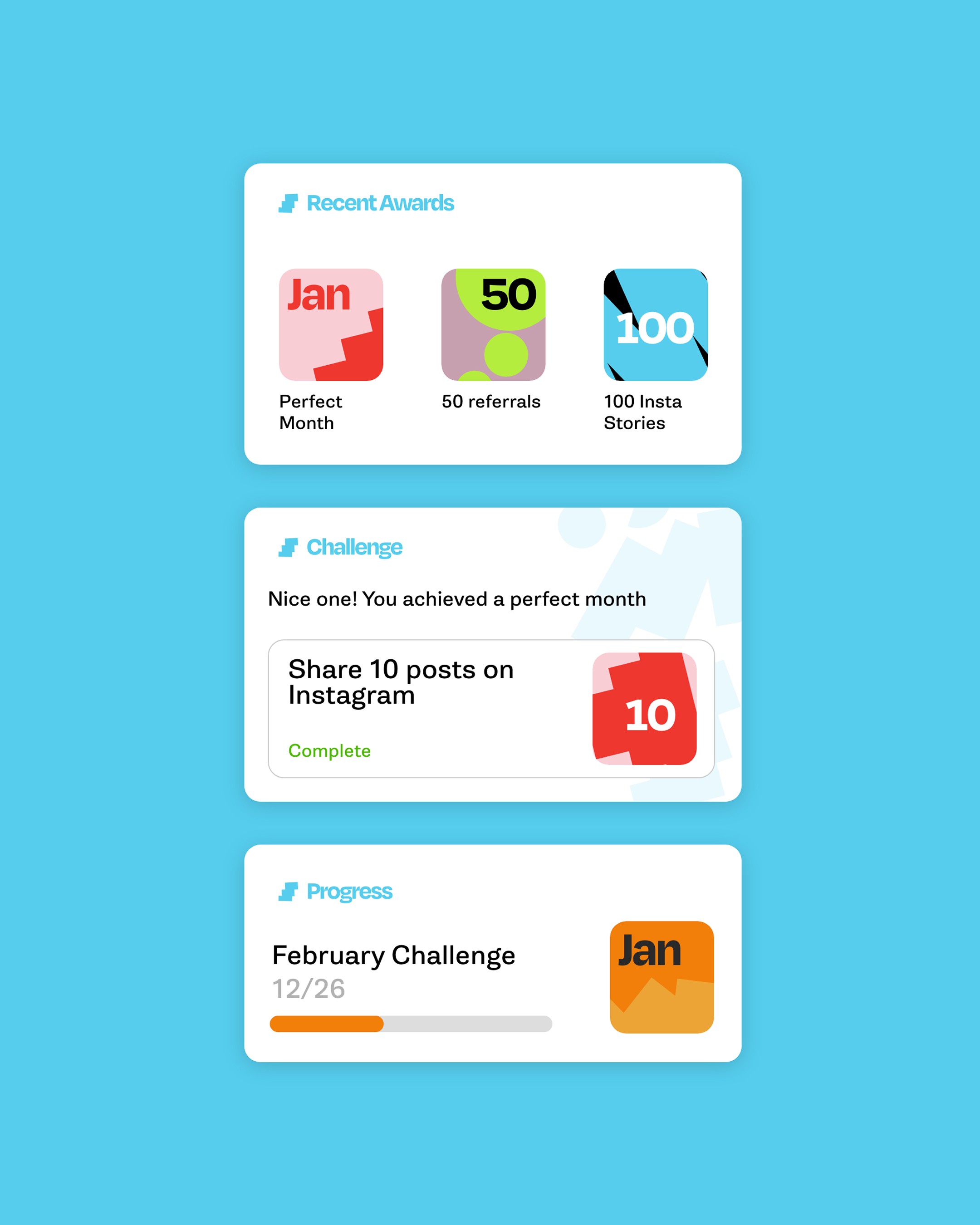
We reimagined Duel’s identity to feel more confident, flexible and human. Clean typography and subtle visual cues helped express connection and momentum, while a calm colour palette and thoughtful layout brought clarity to the experience.
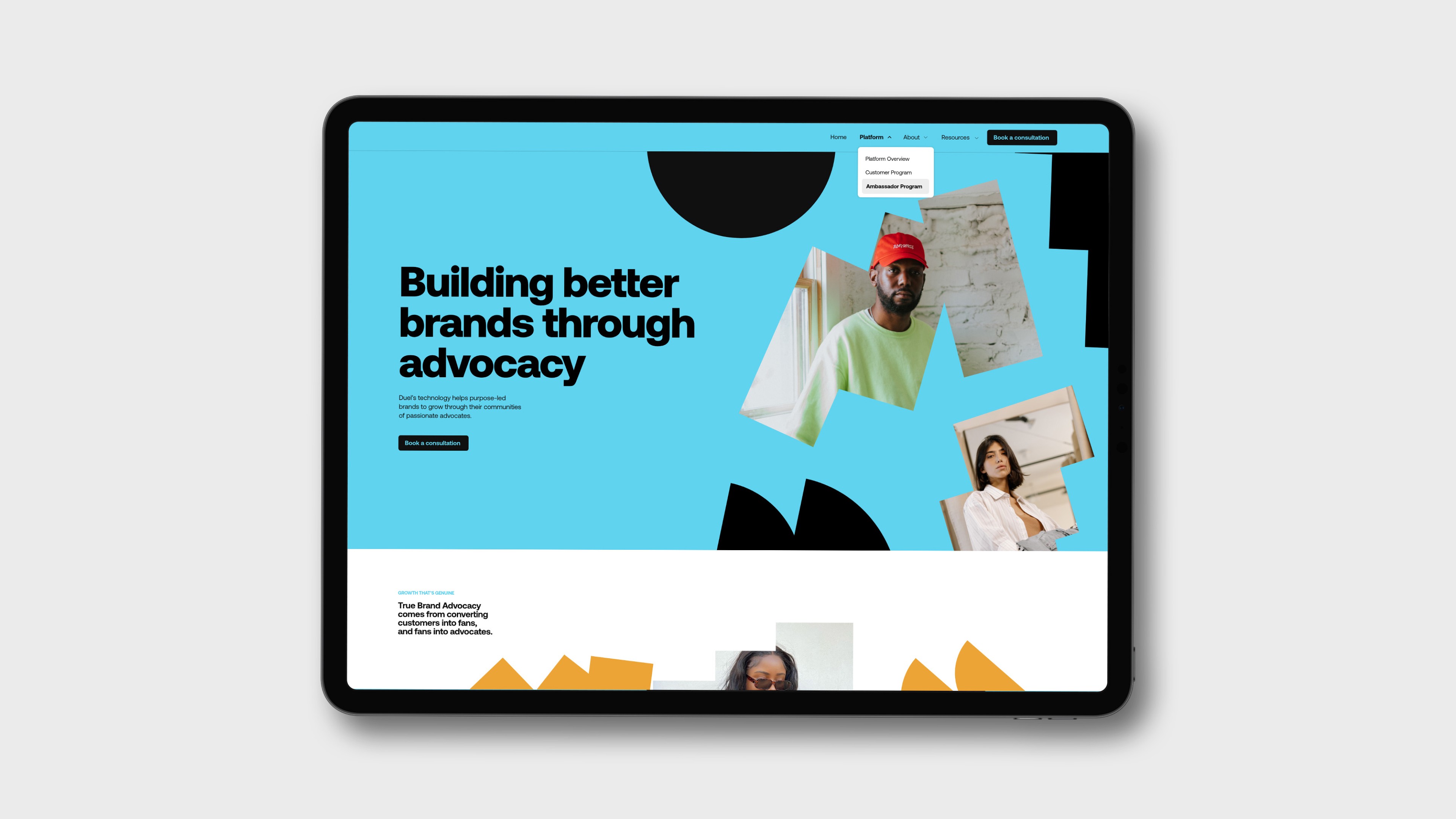
The new website was built to do more than just sell – it also helps people understand the product in simple, accessible terms. Real stories from brands and their communities were brought forward, showing how advocacy can be both powerful and deeply personal.
Results
A sharper platform for a category leader in advocacy.
The new identity helped position Duel as a confident voice in the world of advocacy-led growth. Its updated messaging speaks to the value of advocacy in simple, relatable terms, while the redesigned website supports both sales and onboarding with clarity and ease.
By putting real relationships ahead of empty engagement, Duel now stands out in a noisy space – reaching more of the right people, and building deeper trust with the brands it supports.